ShopDreamUp AI ArtDreamUp
Deviation Actions


Suggested Deviants


Suggested Collections


You Might Like…


Featured in Groups


Description
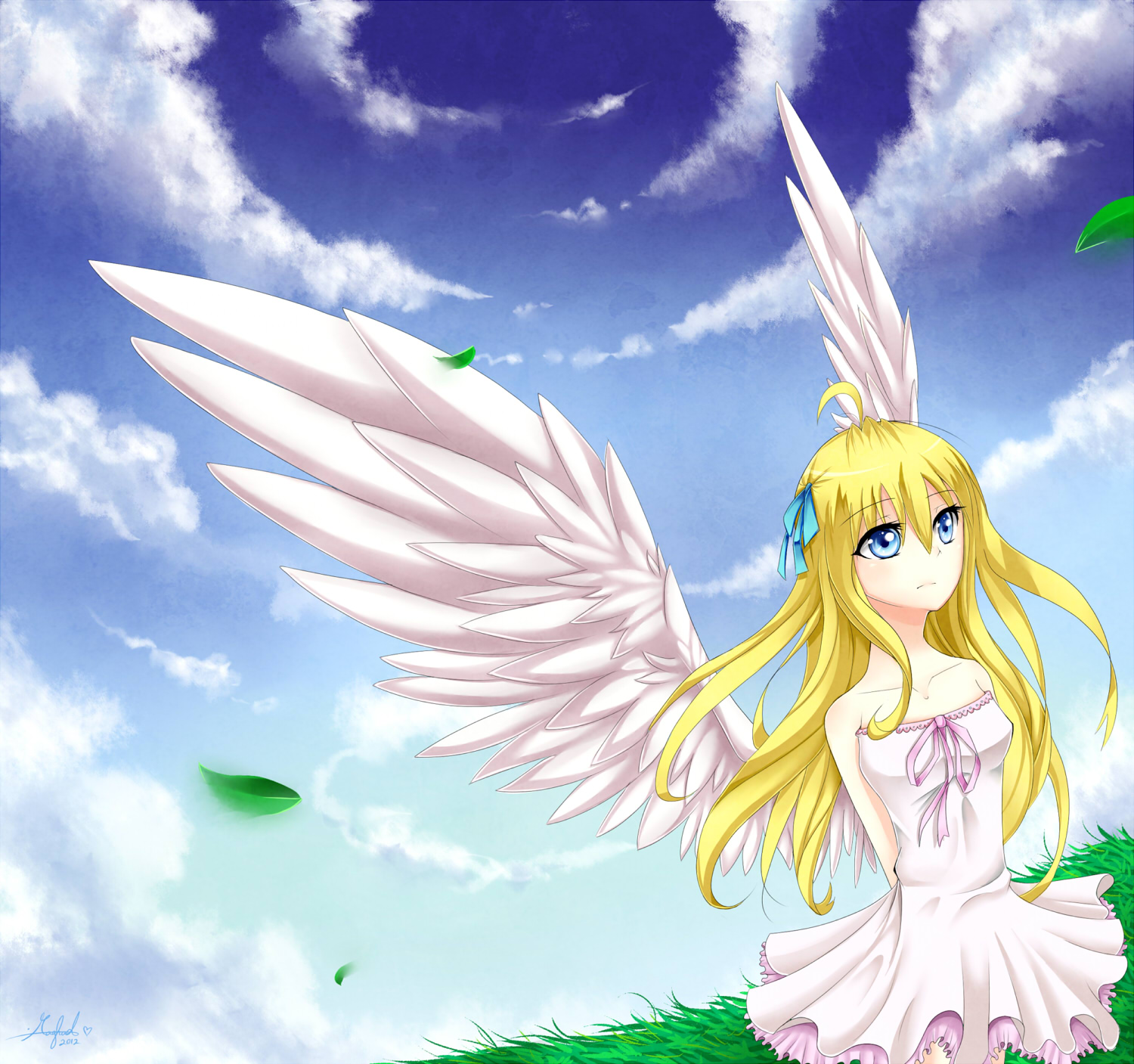
BEHOLD my first try attempt on Paint Tool Sai! 
Yes! i finally decided to try Sai and guess what? I LOVE IT!
As i expected,the effects are great! and the smooth brushes just makes u fall in love with it ;w; <3
Well,this is a random OC ~ This drawing was suppose to be a tryout but i really like how it turned out! i always wanted to draw wings on Sai c'x
I had fun drawing everything! hope u like it >w<~
Do not copy,trace,use in anyway!
Yes! i finally decided to try Sai and guess what? I LOVE IT!
As i expected,the effects are great! and the smooth brushes just makes u fall in love with it ;w; <3
Well,this is a random OC ~ This drawing was suppose to be a tryout but i really like how it turned out!
I had fun drawing everything! hope u like it >w<~
Do not copy,trace,use in anyway!
Image size
1500x1407px 515.54 KB
© 2012 - 2024 Rorita-Sakura
Comments64
Join the community to add your comment. Already a deviant? Log In
It isn't often I write critiques, but here we go; I will try to be as fair as possible.
Let's start off with the background.
The clouds. I believe you used the "Fuzystatic" or the "Spread" texture on your brush while painting the clouds, great use of them. They come out soft, yet crisp-looking. The blue shades in the sky also blends into eachother nicely. The clouds cirlce-like formation is a bit tad overused one, but the execution of it is done well, although the angle of the sky and the grass doesn't match up with the angel's. (The perspective of the clouds are seen like if someone was standing in the middle of the piece, slightly looking up towards the sky. If you had slightly changed the perspective of the grass, a person sitting on the edge of it could have worked well with it. But the angel's kinda tilted position make her look kinda off and lack a bit of connection with the rest of the picture.) I love the green tones you used for the grass and the strokes are curved in a nice way that enhances the windy effect of the picture together with the leaves (Though the blurry parts on the leaves make it seems like the wind is coming from the left when the grass make it seems like it coming from the right). But remember that the further away things are, they tend to lose detail and blends in with the color of the sky (Looking up some pictures of mountain ranges or large acres can give you some good examples of what I'm trying to say).
Let's head over to the angel herself.
The glossy, blue eyes are really pretty - like she has a little sky in there also, haha. Her head looks good but the rest of the body concerns me a little. It's way too thin and makes her look she has a severe case of aneroxia nervosa, girls have more curves then just on the chest (I love the shading on the chest by the way), don't afraid to draw a little of body fat, they don't have to be sticks to look pretty, it's actually more interesting to look at different body shapes! Her shoulders could also be a bit broader and more curved. As she is kinda rest backwards, her ribcage should also be visable right below her breast, which they're not here. Her hair style is adorable, especially her little up-do at the top of the head. c: But when looking at the flowing hair I'm kinda confused yet again from which way the wind is coming, same thing with the dress (where it looks like it's coming from underneath or belhind her). The dress design is simple - but cute! And the draping/ruffles are prettily done.
On to the wings.
Nice gradient shading here as well. The wings looks really scruffy, nearly spikey though, because of of the placement and size of the feathers. Also feathers overlaps eachother tightly so there's not a lot of shadows at the base of them. The size wouldn't neither be able to keep her flying. Try to look up some reference pictures of birds wings, Swans and Crows are some nice and simple ones. - Although the wings are also heavily shoujo anime stylized, so they're still acceptable (Though it doesn't hurt knowing how they're originally built up ;) ).
The angel lacks an expression on her face, and the body language doesn't tell me anything either, though if she was meant to come of emotionless - you did a great job on that.
Nice use of textures and the coloring and shading techniques you use are also good, you also get even more credits from this being the first time you use SAI.
When looking more at the picture I have realized that it also lacks a consistent light source, light seems to come from all directions.
The deviation ".:Angle Girl:." comes of as a bit mediocre, but is still a treat to the eye. Nice work, Raghad.